projects about
Visual design for the MooiNL Atlas, an interactive digital atlas exploring the future of the Netherlands.
Year
2025
Client
Ministerie van Volkshuisvesting en Ruimtelijke Ordening
Studio
CLEVER°FRANKE
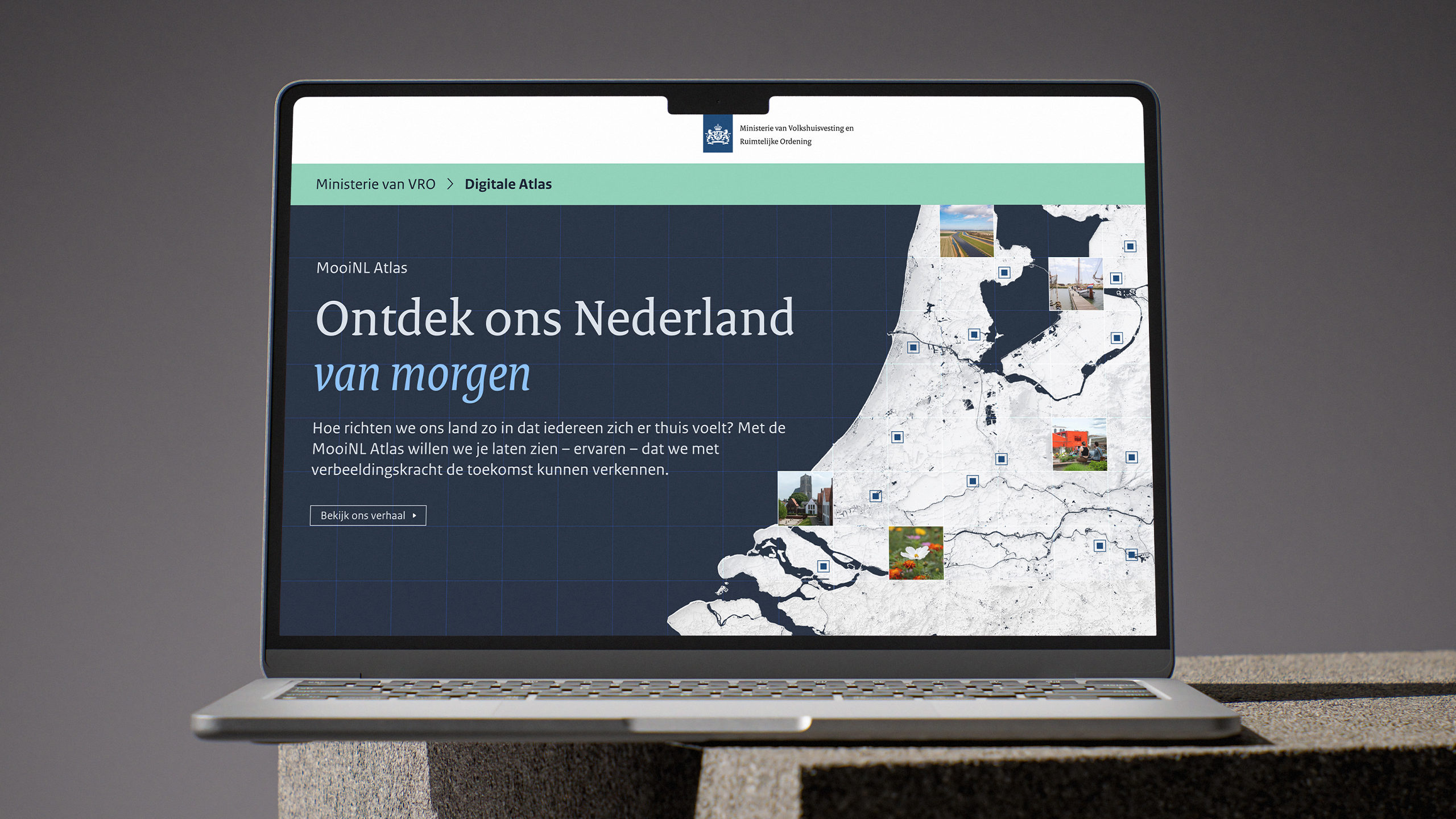
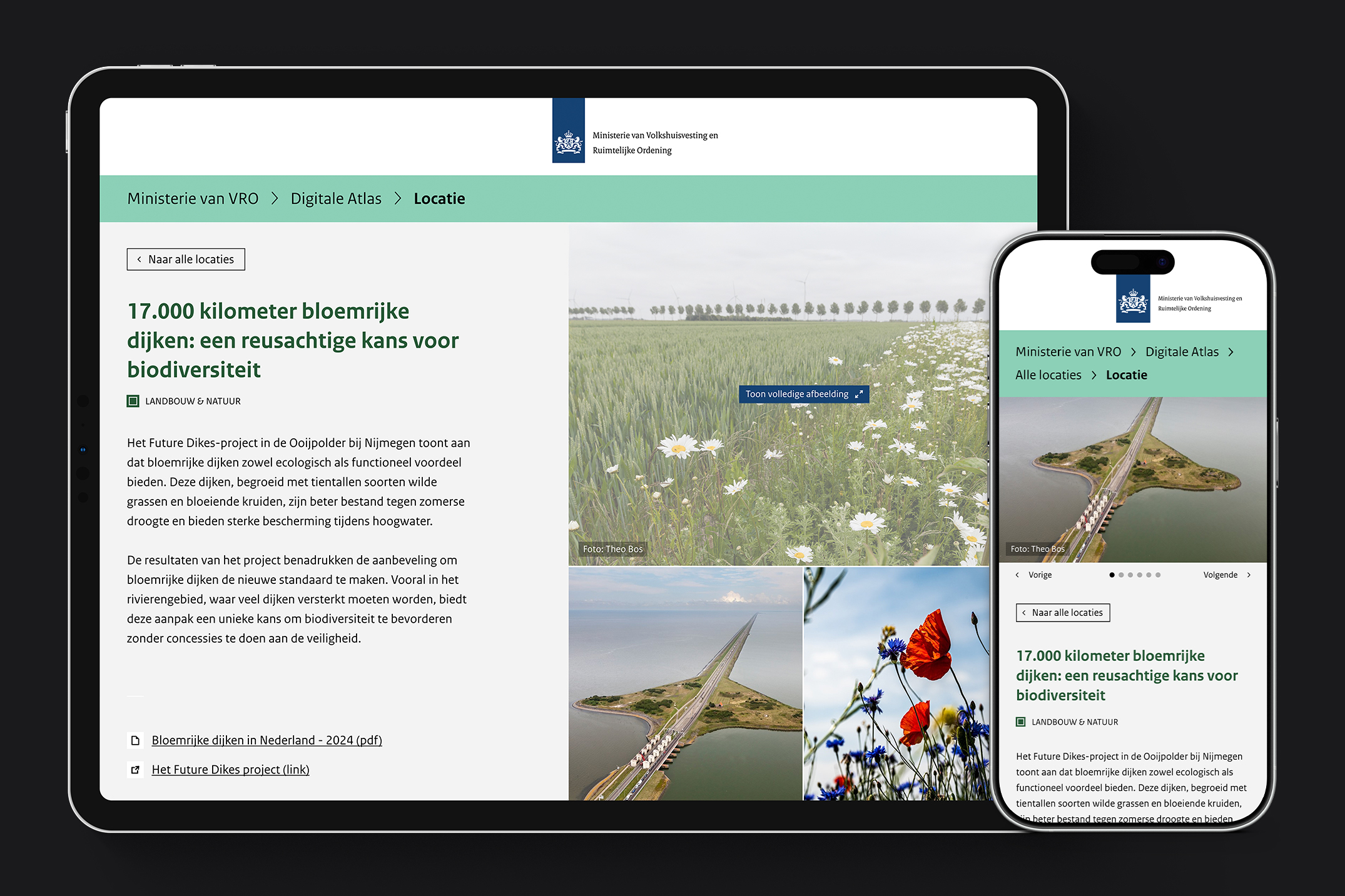
The MooiNL Atlas is a digital platform commissioned by the Dutch Ministry of Housing and Spatial Planning, mapping sustainable projects and initiatives across the country. It invites citizens to explore locations where the Netherlands is already well-designed, and to look ahead at what the country might become. The visual design was developed at CLEVER°FRANKE, in close collaboration with a UX designer and developer.
strategy
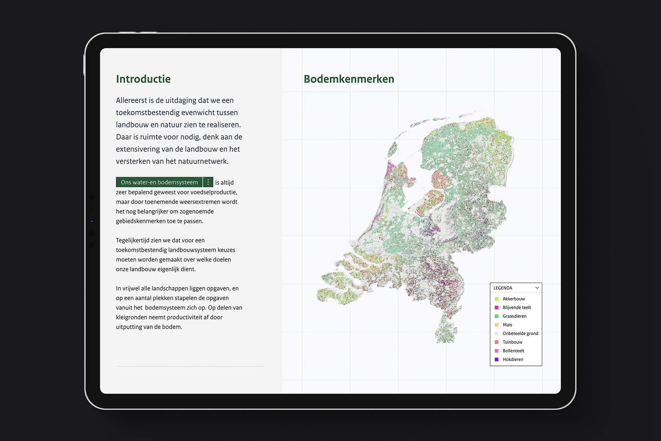
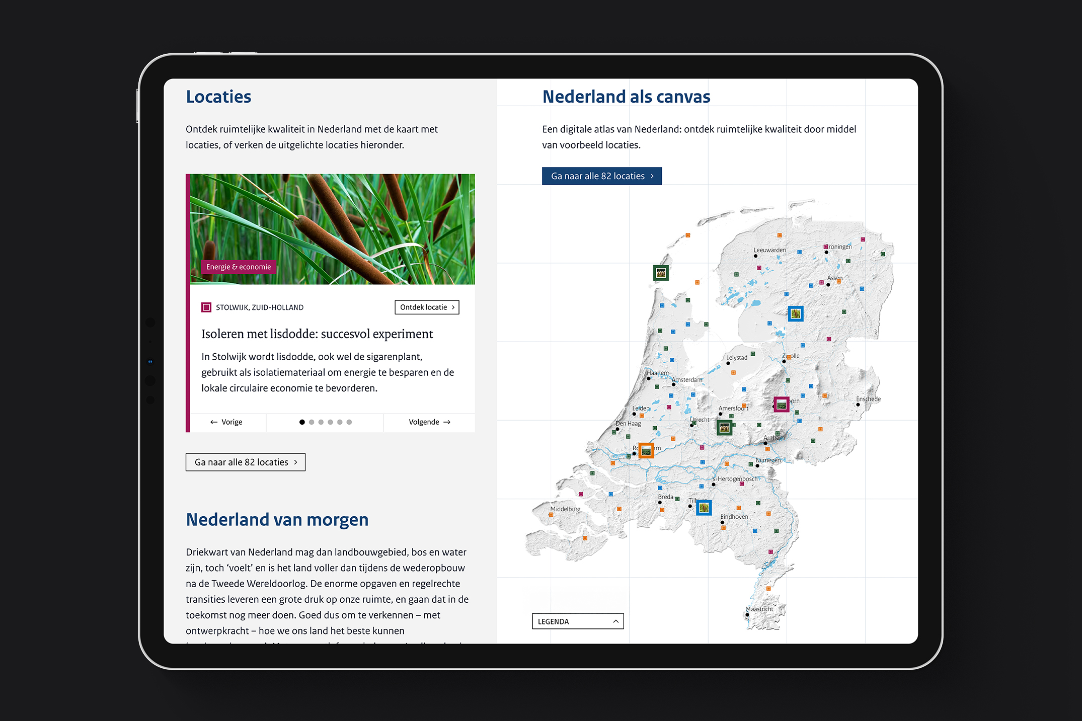
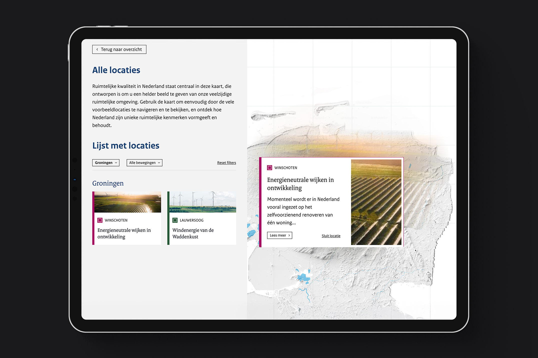
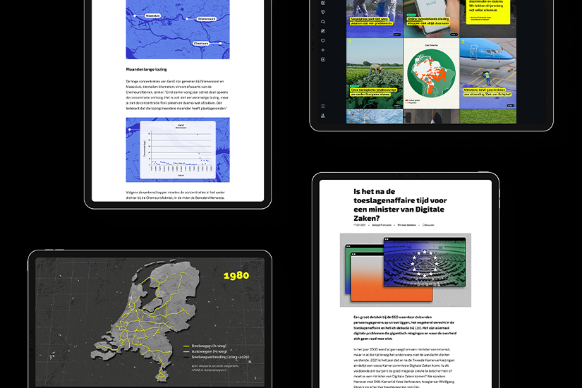
The platform needed to make complex spatial information accessible to a general audience. Scrollytelling was chosen as the core interaction model: as the user scrolls through information in the left panel, the map on the right responds in real time. The challenge was designing something that felt open and inviting while remaining within the strict branding guidelines of the Dutch government.
design
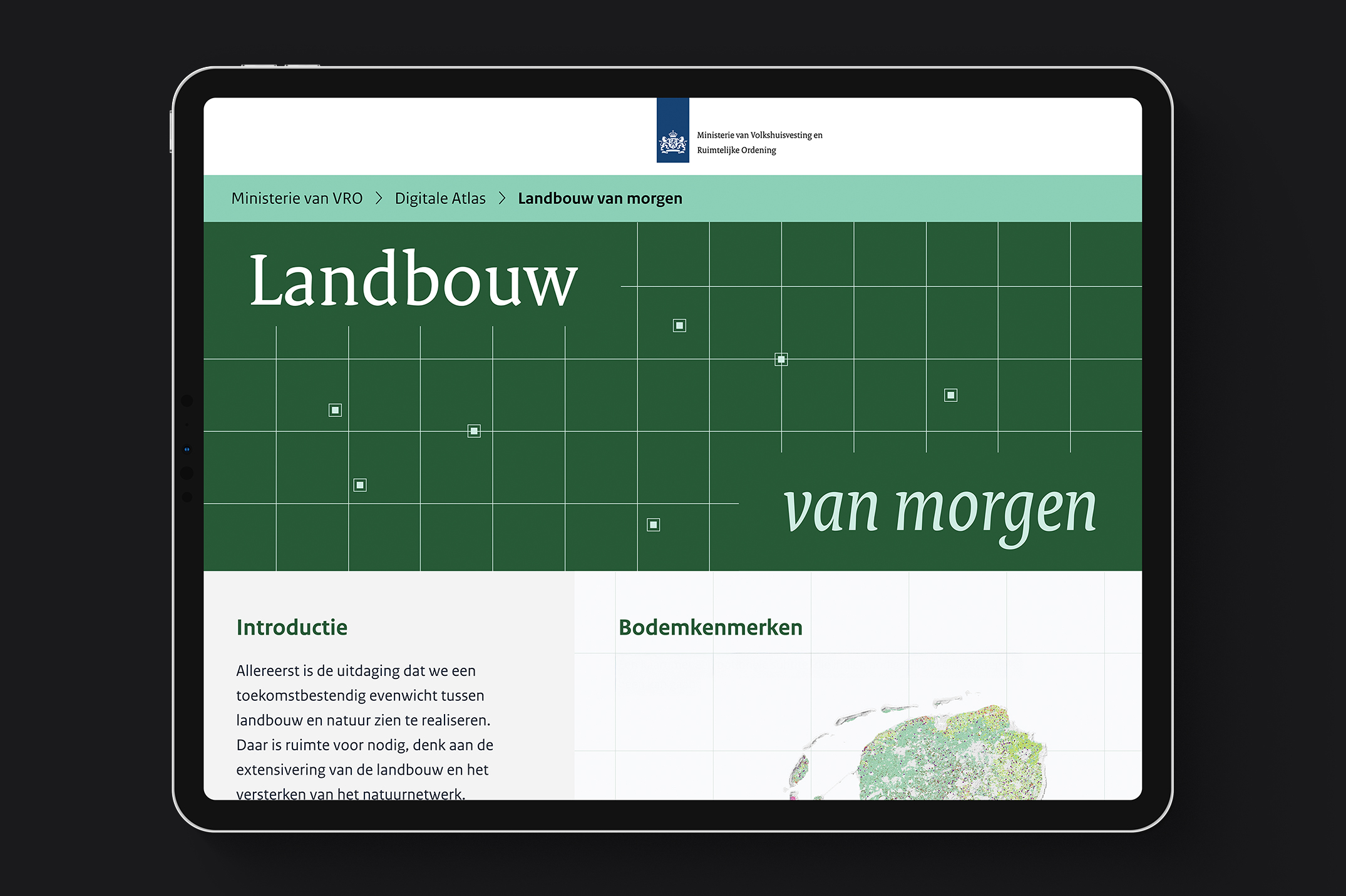
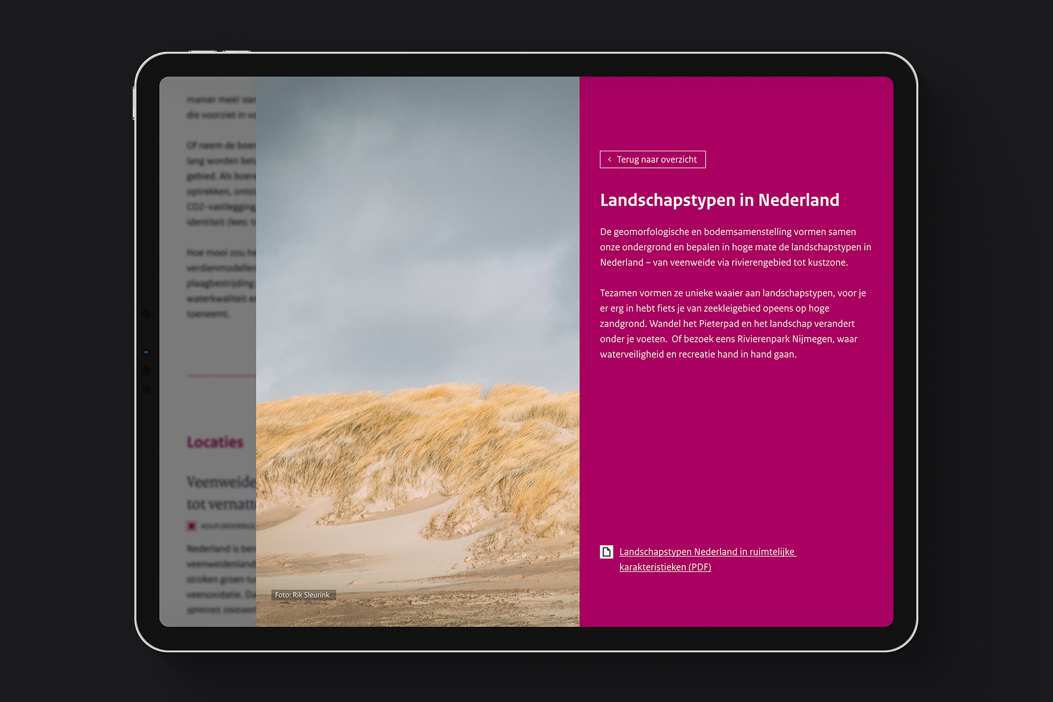
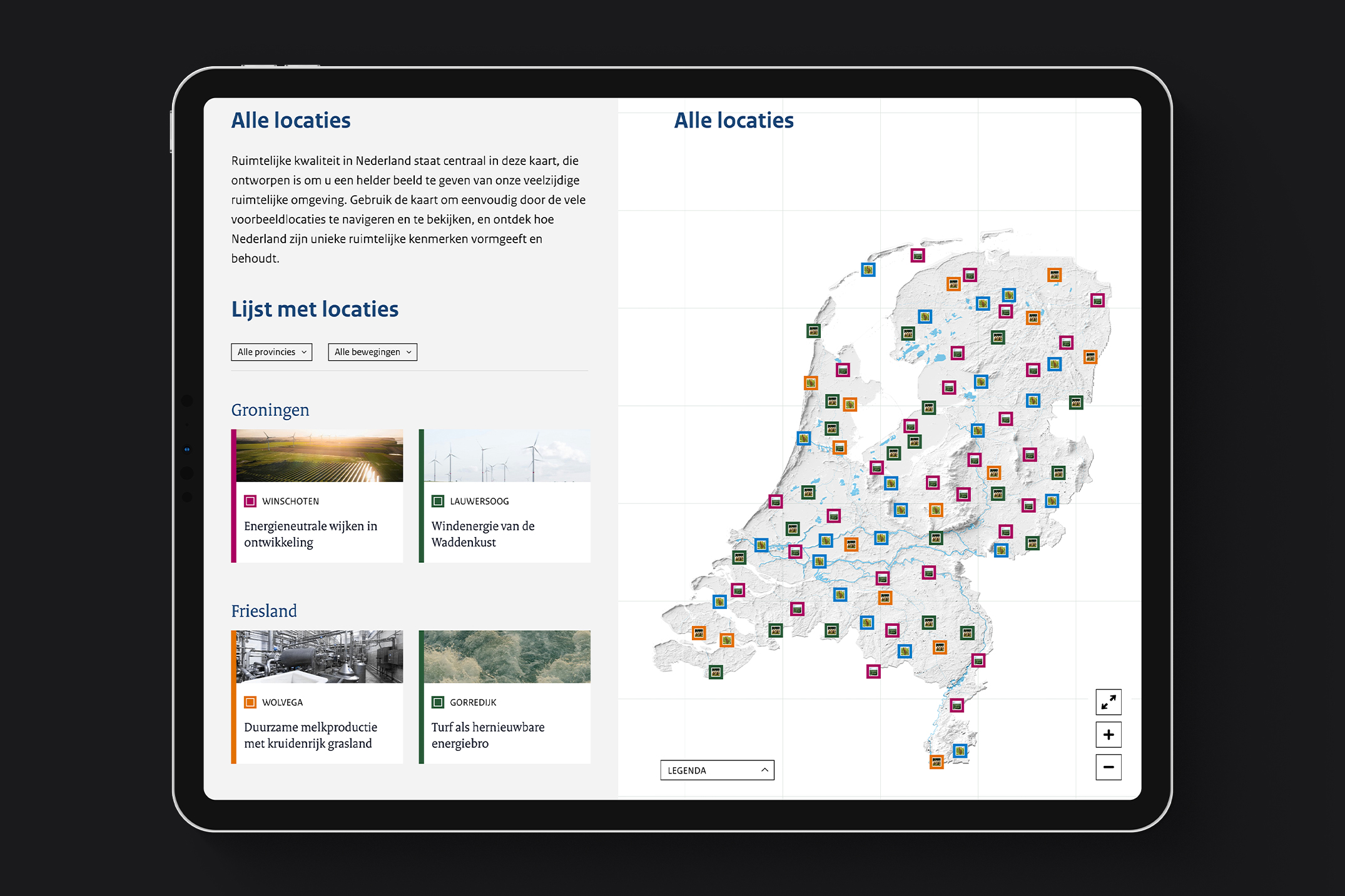
Working within the Dutch government's identity framework meant limited room to manoeuvre, but that constraint became a creative starting point. By combining the government's own typefaces and colour palettes with simple visual elements, such as map grids and location markers, it was possible to give the atlas its own distinct character without breaking from the identity system.
insight
Designing within a rigid branding system forces a different kind of creativity. When the obvious tools are off the table, the focus shifts to how existing elements are used: their scale, repetition, and placement. Working within constraints can produce something more considered than starting from scratch.
deliverables
The project delivered a fully designed interactive atlas. The platform documents over fifty locations and includes several narrative storylines exploring the country's spatial future, serving as a reference for citizens, policymakers, and spatial planners.